Paul Raymond Publications 1978 Watercolour
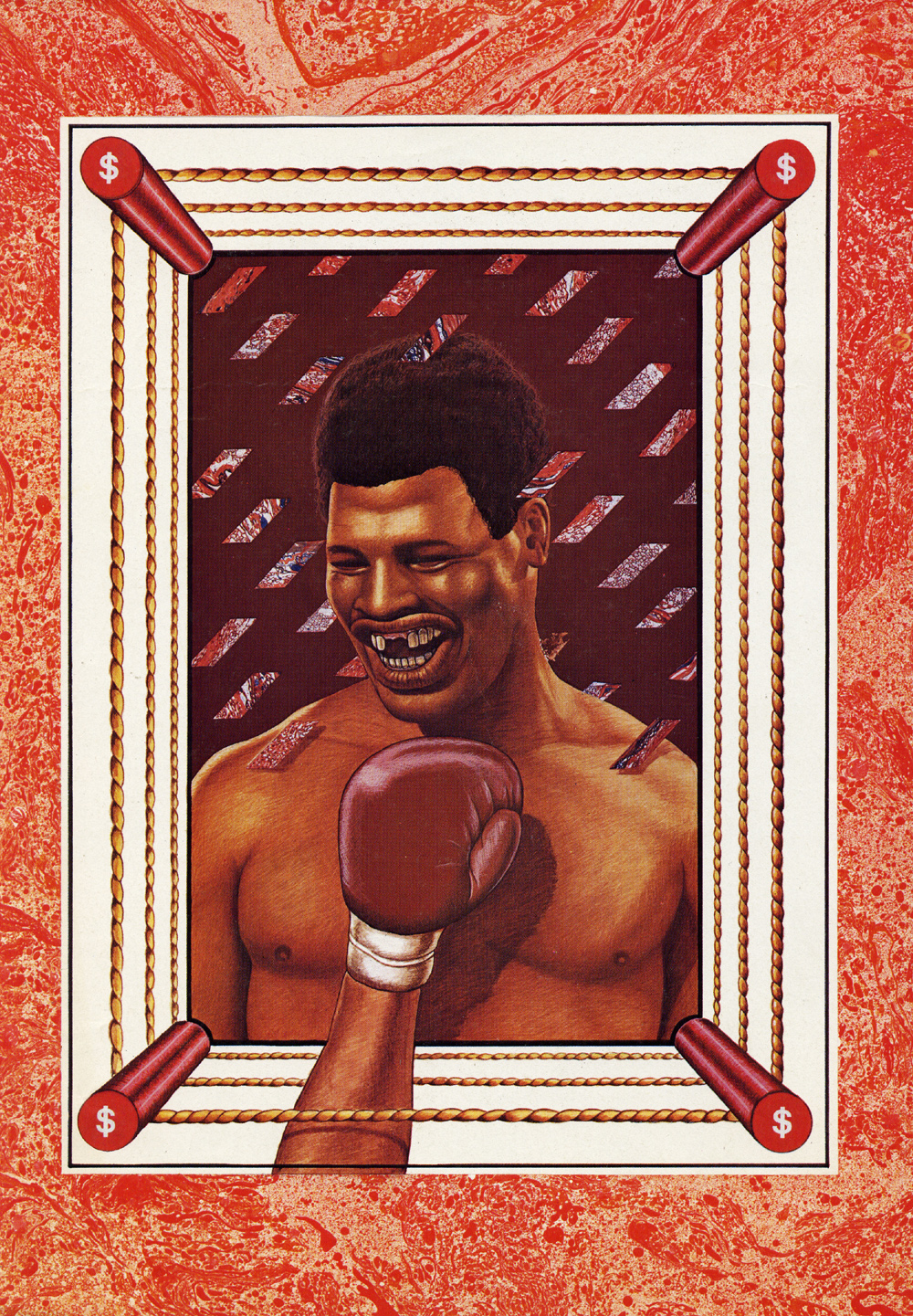
This piece was commissioned by Paul Raymond Publications and appeared in either ‘Men Only’ or ‘Club International’ sometime in 1978 (my printed proofs don’t have exact dates). I was given an open brief, a blank page as it were (my favourite kind of brief). The article in the magazine (yes, gentlemen’s magazines actually had editorial content in those days) comprised an interview with the American boxer Leon Spinks. Leon had been in the news after being arrested for possession of drugs which he hid under his hat. Sadly he became a figure of fun in the media despite winning a bout with Muhammad Ali to become undisputed World Heavyweight Champion, which was short-lived. My initial ideas involved images of the hat and drugs but I elected to remove the obvious literal references and concentrate on the idea of ‘blood money’ which of course is what boxing and drug culture represent. I was pleased with the result and the Peter Blake influence is obvious. This was also before I started using the airbrush. The red marbling border was made by spraying Humbrol spray enamel onto water in the bath and lifting off with paper. A trial and error process until a promising sheet is produced and the frame shape cut out. So in fact the artwork is part collage.
~
Watercolour 1978 6 1/2”x 8”
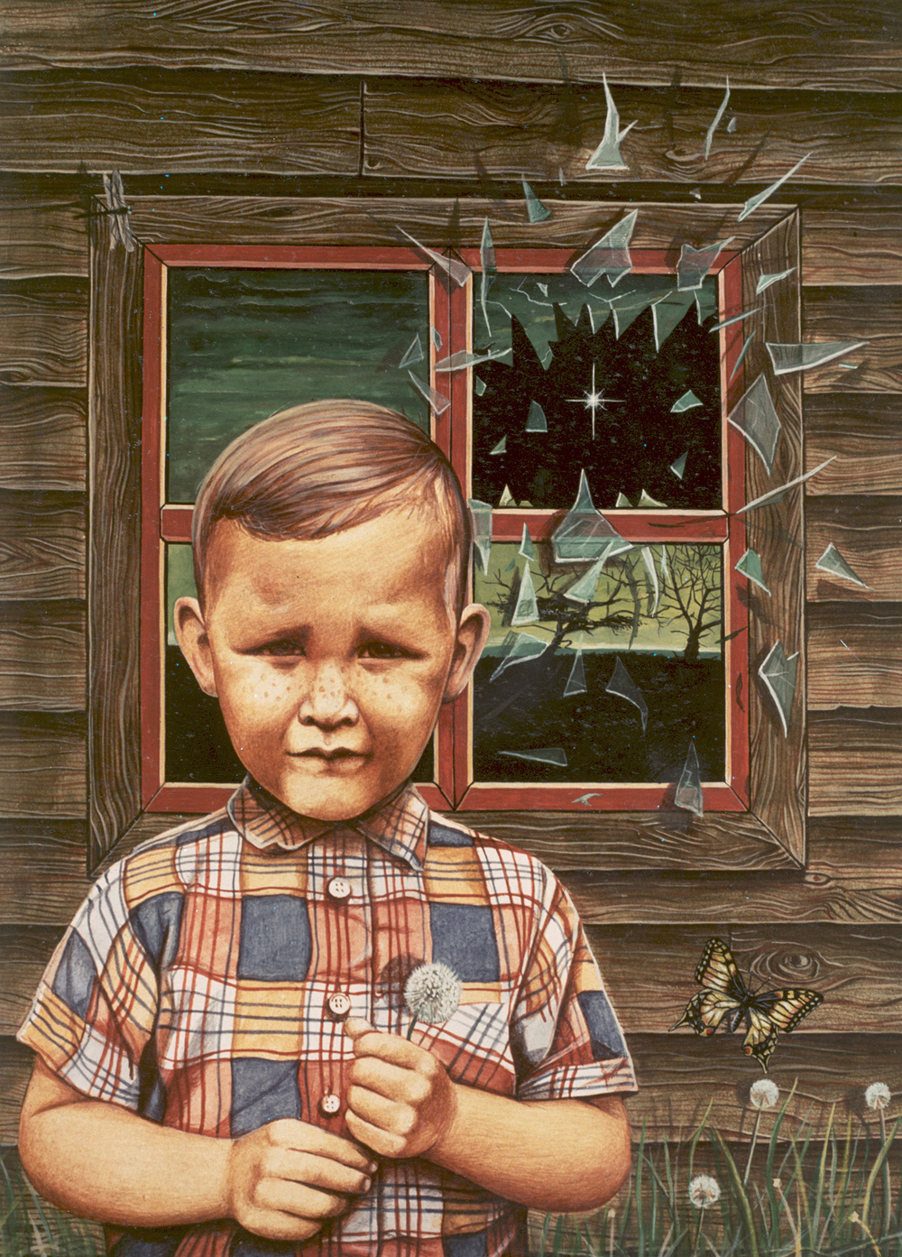
This image was produced specifically for my portfolio shortly after leaving Canterbury in 1978 and was not published. It is an imaginary book cover. The idea is based on a short story of a boy and a ghost, the author of which I forget but I seem to remember it had a strange atmosphere and was not a ‘scary’ type story. The boy image is in fact yours truly, from a photograph taken in Canada around 1957. Again this is before my transition to airbrush, and a friend commented that it had a Grant Wood, Andrew Wyeth quality. Fine by me.
~
Paul Raymond Publications 1978 Watercolour
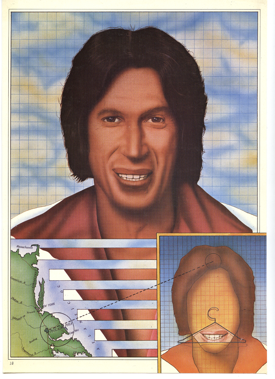
This is another Paul Raymond commission so it is either Men Only or Club International circa 1978. Again the brief was totally open, simply read the provided copy and produce a visual analogy of some sort. It was really the reason why working for Magazines was the most fun and as an illustrator you could operate in that blurred zone between art and illustration. The article was an interview with the American comedian David Brenner who was very popular at the time, in the USA anyway, he never quite caught on in the UK and this interview was by way of an introduction. In it he joked about New Jersey and his nose which he said he used to hang his clothes on, hence the clothes hanger. So here I used a literalness in an almost banal way, using a diagrammatic Spike Milligan/Terry Gilliam approach. Also this is my first full blown airbrush artwork. And as for the fashion shirt….enough said.
~
Cosmopolitan Magazine 1978 Watercolour
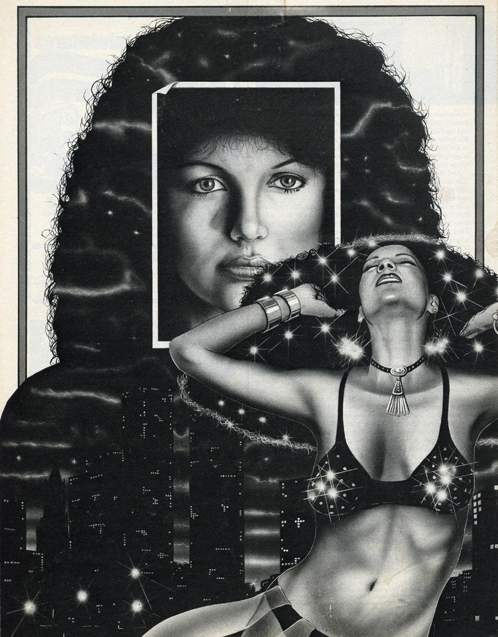
Here is an editorial illustration used to accompany a short story in Cosmopolitan magazine 1978, the short story of a woman leading a double life in the big city. I seem to remember that it was important for the dancer to express freedom rather than be just someone dancing and it took a while to resolve that problem. Also the artwork was sent back because the breasts (or the ‘boobs’ as the nice lady at Cosmo said) were lopsided and I had to give one a lift as it were. I delivered the artwork myself to Cosmopolitan’s offices and I’ve never felt so out of place in my life and was teased relentlessly. Also I was introduced to a new assistant art director who was a Punk! He looked like that bloke from the ‘Cure’ but rake thin and he was to supervise my next commission from the magazine. I am trying to track that piece down and will add it to this page at a later date.
