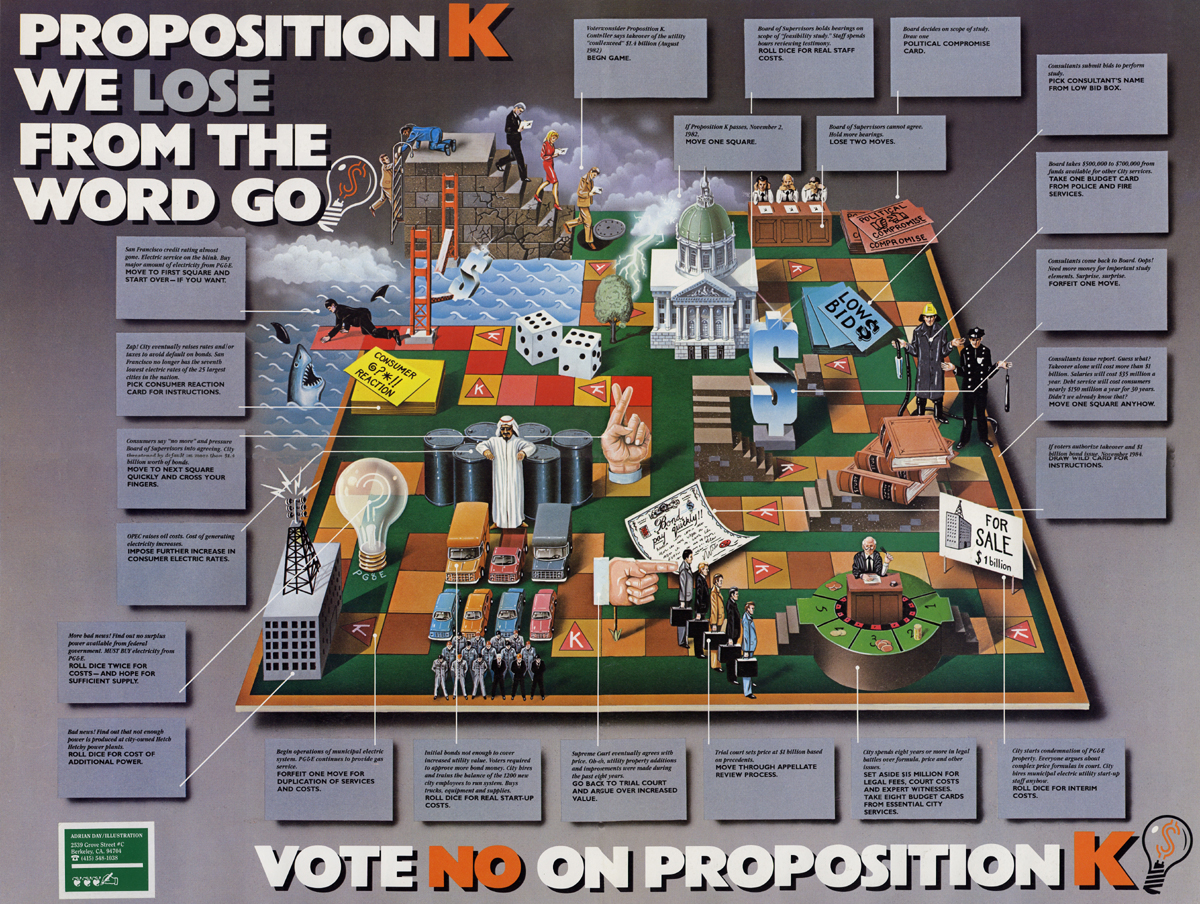
Solem and Associates of San Francisco, a political PR company, commissioned this illustration for a mailshot in 1983. I worked with Jeff Loeb and John Thomlinson. It was designed to illustrate the difficult process of privatising the Utilities. Proposition K was on the election ballots to allow people to vote on this issue. Of course people can be persuaded to vote either way and various lobby groups spend money on PR to persuade the electorate. I really enjoyed this project and the original brief mentioned a Rube Goldberg ’cause and effect’ scenario. I even managed to sneak in a Frank Zappa ‘Lookee likee’.
–
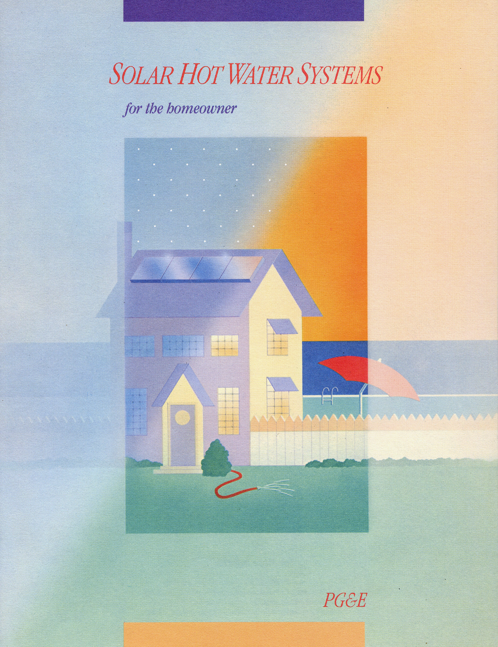
A brochure for PG&E designed by Maria Wang in San Francisco. This project was very tightly controlled right down to specifying the Pantone colours. It was printed onto uncoated stock which gave a very pleasing soft effect. Maria was probably the best designer I worked with in San Francisco.
–

The Ampex Golden Reel Award Program, a kind of Oscars ceremony by the recording manufacturer. I think the designer was called Debby at McCann Ericson. I managed to persuade Debby to use a rendered gold effect rather than gold foil.
–
Earthquake Safety Posters
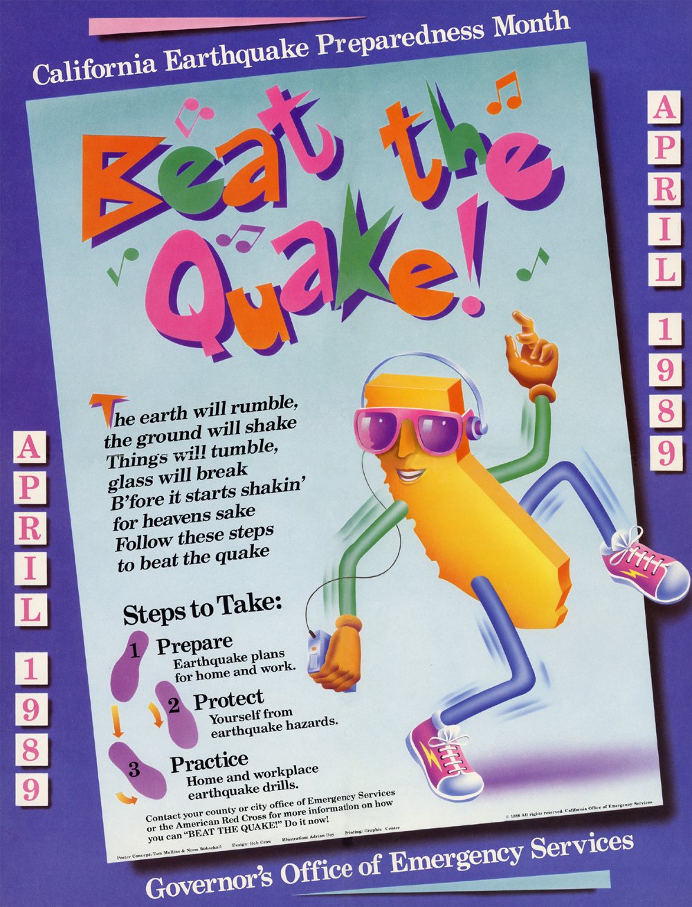
These earthquake safety posters were designed by Bob Crow in Oakland. The basic sketch for the cartoon was done by someone’s wife at the office for emergency services. It’s supposed to be an animated map of California. To save money the artwork was done same size as the reproduction, about A2.
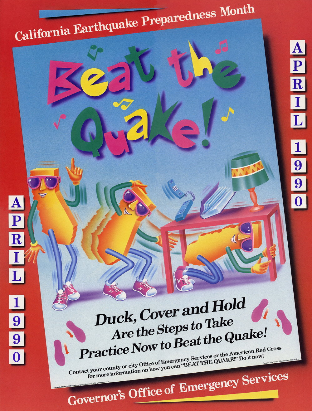
A fairly serious Earthquake happened in October 1989. Bob’s studio was trashed. Luckily I was living in an old fire station that had been built after the 1908 Earthquake and it was very resilient. The Cypress Viaduct collapsed and this was frequently used by everyone to get to the city and surrounding area.
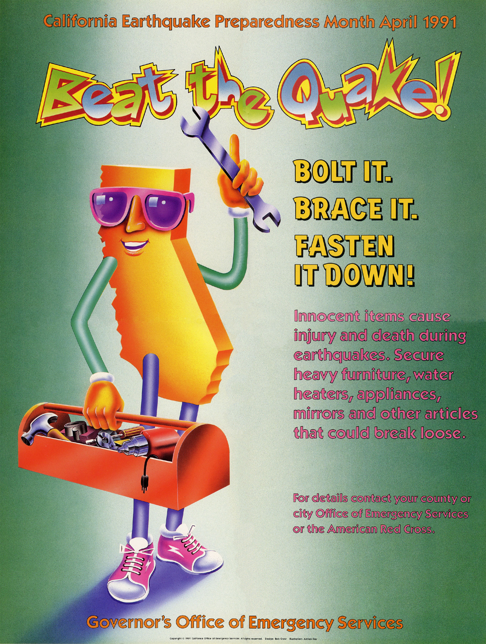
Bob decided to retire and moved to northern California. This was our last poster and the contract went to someone else who no doubt used their usual people.
–
–
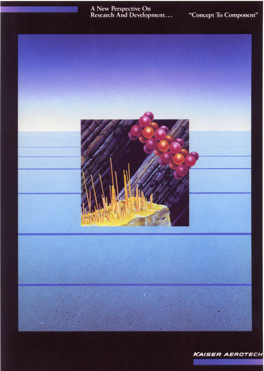
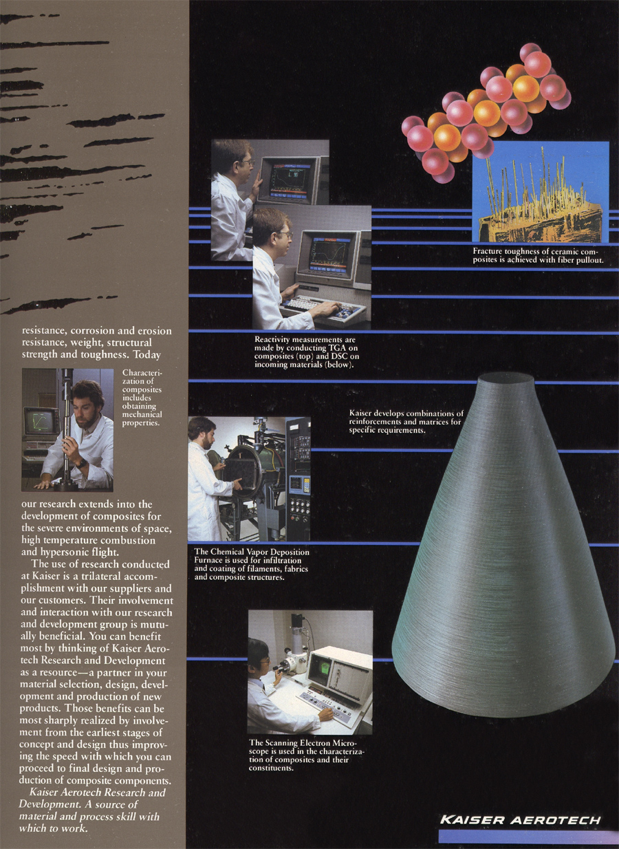
Kaiser Aero-tech Brochure
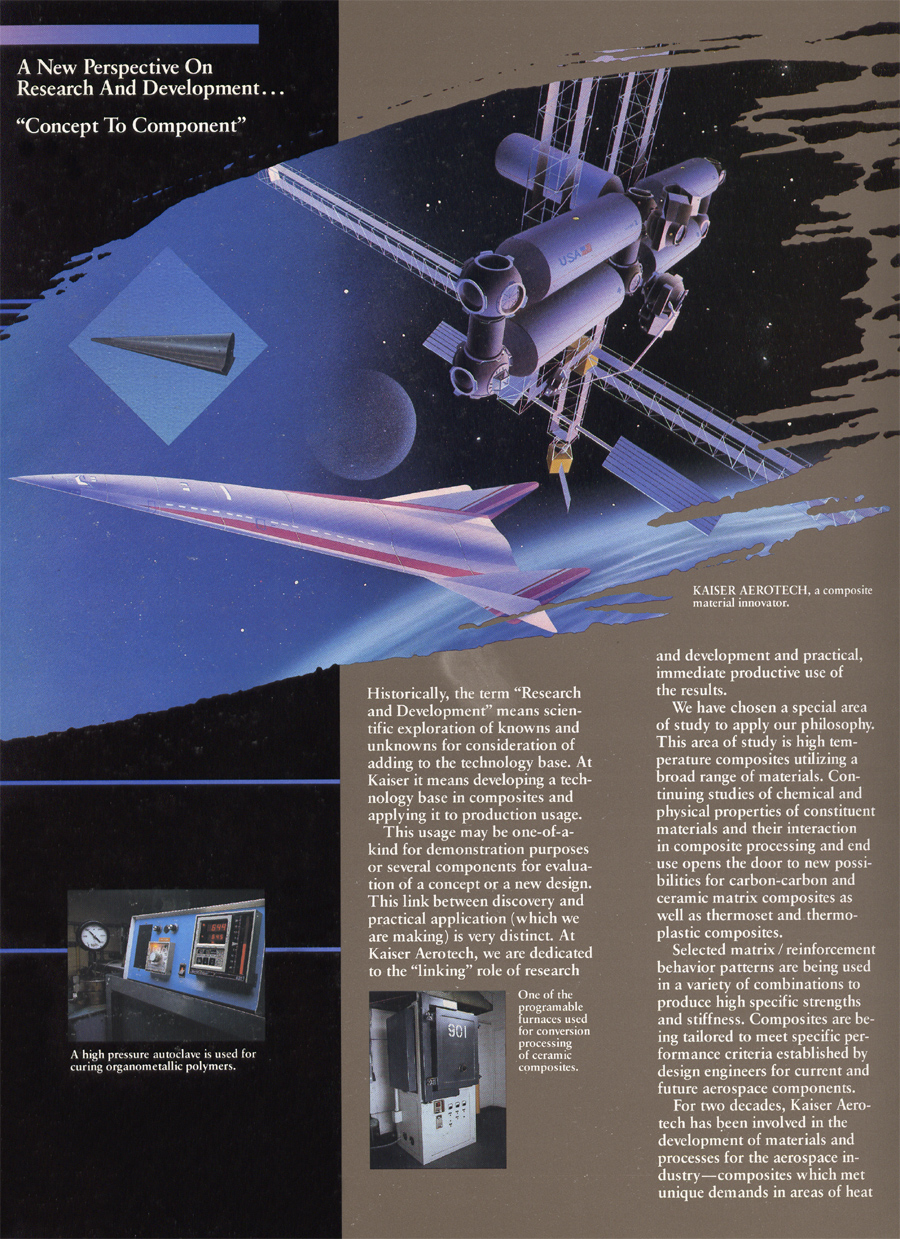
Inside 1
Inside 2
